|
|
**I've found out by trial and error, that if your photo / image is
rectangular in shape (not a square), then it's best to break the
chain link when increasing the width and height values ... add
the same number of pixels to each value. This will give you a
border of equal thickness all around your photo.
Another way to add a border to your image is by using ...
.... Edit > Stroke Selection.
This trims off the
edge of your photo, replacing it with a coloured border ....
the colour in your
foreground
colour box.
1. Select a colour
for your foreground colour box (eg black)
2. Click on Select
(on the top toolbar) > Select All (the entire photo)
3. Click on Edit
(on the top toolbar) > Stroke selection
4. Change the line
width (in pixels) if you so wish.
5. Select "solid
colour" ... this is the default setting, anyway.
6. Click on
"Stroke selection".
7. Repeat the Edit
> Stroke Selection, if you wish to make the border thicker.
8. Select >
None, to remove the marching ants (Shift + Control + letter A)
9. Save your work
.... File > Export
You could use the
Undo History dialog, to go back in time to re-do any of
this.

To add a white border
just below your photo..
Change the BG colour to white (by pressing the letter X on your
keyboard).
Click on Image > Canvas Size
Click on the chain link to break it, if it's not broken.
Increase the Height value (and watch what happens to the little
photo image as
you do so). Don't press the "Center" button.
In
the Layers area, select “All Layers”
Click
on Resize.
At
this point you might wish to add a thin black border
to
surround both the photo and the white canvas
underneath (to
demarcate the boundary of the latter), before you add any text.
Save
your work …
File > Export > change name and/or location > set
your quality
>
Save.
Using
Levels
You will see that with both Levels and Curves, which follows,
that I don't create an additional "adjustment" layer. Using an
adjustment layer is the conventional way of doing things but
for quick and simple fixes to your photos, I don't think this is
necessary. (In Photoshop Elements, you're not given the
choice.)
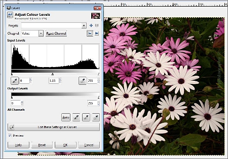
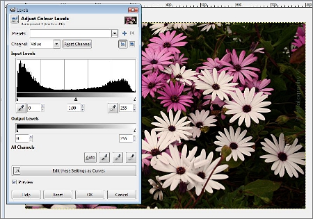
You can
change the brightness / contrast of your photo using
Levels. If you click on Colors (on the top toolbar) > Levels, after
you've got a photo up on the screen, a histogram
will
appear
on your screen. This gives you a map of the
tones in your photo ...
|
Dark tones are on your left,
mid-tones are in the middle, and light
tones are on your right hand side. You will see in the histogram
that the tones are not evenly distributed in this photo ... there is
too much black in the histogram at the extreme left. If you'd like to
lighten or darken one of your photos, just move the middle triangular
slider (below the histogram) one way or the other. This will change
the mid-tones in your photo. Move the other two sliders if you
wish,
and see what happens.
I have lightened
the image by moving the middle slider slightly to your
left ... the input
level value has changed from 1.00 to 1.15.
Press OK to finish.
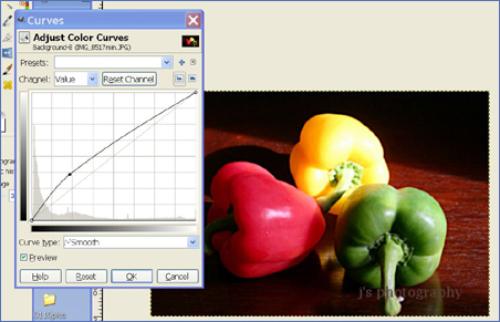
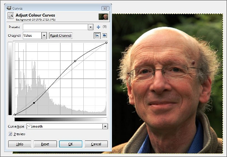
Using Curves
Another way of
making your colours / tones more vivid is to use
Curves.
Colors
(on the top toolbar) > Curves.
|
The dark tones are on the bottom left, whereas the lighter tones
are
on the top right. If you click on the straight line in two places,
and
then drag the nodes to make a slight S shaped curve, as
shown above, then you can very
quickly tart up your photo.
Click
on the straight line to create the first node and then drag it
slightly up or down, before creating the second node and moving
this one.
So
this can be a quick fix, similar to using Levels.
Curves comes with its own "colour/eye dropper" tool, so you can
sample a colour / tone is on your photo with the tool, which
will
pinpoint where on the straight line this colour / tone is. You can
then
tweak the node to produce the colour / tonal change you want.
In the Channel
Value drop-down menu, you can select a particular
(RGB) colour you'd
like to change the tone of.
Here are a few more examples of using Curves ...
You will see that this photo is too dark in places, & too light in others.
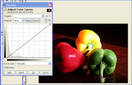 |
By clicking on the Curves line towards the dark corner, and then
dragging the resulting node upwards, you can lighten the dark
areas, as shown in the next photo ...
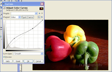
In the next photo, you'll see that I've clicked on the Curves line,
higher up the slope, and have dragged it down a little, thereby
making the highlights in the photo less bright. Press OK in the
Curves box, to finish.
I reckon you could achieve the same result using Levels.
You can use Curves or Levels when restoring your ancestral
B&W photos ... to add a fresh quality to them.
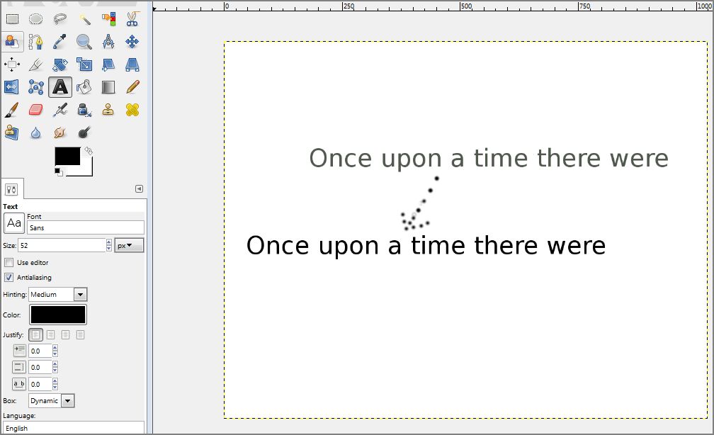
Adding text to your
photo ....
Have a look at the new style of writing text with Gimp 2.8.2 ...
http://docs.gimp.org/2.8/en/gimp-image-text-management.html
Gimp now allows you to edit text directly on the "canvas" and
not in an additional floating text box, as in previous versions of
Gimp. This has been replaced with a semi-transparent text
tool box, which I don't think is of much use. Instead I use the
use the text tools in the lower left hand tool box section.
Create
a blank white canvas in Gimp, to practise on.
I would suggest using 1024
x 800px. for its size.
Click on the Text tool in the left hand toolbar (the
icon is an A).
In the Text tool area
below the toolbox, try these out …
Font
style Sans
(the default setting - click on the font box to try other fonts also)
Font size
52 px
Colour
Black
Click on your
canvas, and type the words you see in the example
below. You will see your text appear in a slim horizontal text box
on the canvas. To add another line of text below this, press the
Enter Key. Just above the text, you will see the semi-transparent
text tool box (which I haven't mastered as yet).
You can change the font style and size, by changing these in
in the Text tool area
below the toolbox. If your text disappears
from view, you can restore your text by clicking on the edges of
the text box, and dragging them out a bit.
To change the colour of the text, select / highlight the text as you
would in a Word document, and then change the colour in the
top (foreground colour box). Click on the highlighted text, to
remove the highlighting.
The text you have just typed is a movable layer, sitting on top of
the white canvas. To move the text to another position, you have
to use the Move tool (the four-arrowed icon just below the
Scissor Select tool). You then click on one of the text characters
and drag the whole line of text to a new position. You might have
to have another go at clicking on a text character, if it doesn't
work the first time. Even simpler is to go back in time with the
Undo History box, and start creating your text again, in a
slightly different position. You can copy and paste text, by the
way, to save time. 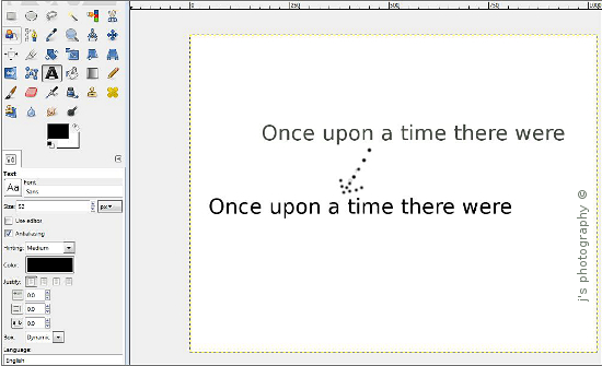 |
Click on this image to see a larger version
To
flatten the layers (text layer + white canvas) down to one layer
prior to saving your work, do a Rt mouse click in the large empty
white space of the Layers
dialog > Flatten image.
To add letttering of a different colour to text you've just created,
flatten your existing text into the background image, choose a
different colour for your text, and start typing again. Then flatten
your work down to one layer again, and save it.
Save your work … File > Export (Alt + Ctrl + E)
XCF, PNG and GIF images / files
Sometimes you might save your work (say using File > Save As)
as a .xcf file without realising that you've done so. When you come
to look for your saved image, you will see that it's got the Gimp
mouse logo on top of the file (when viewed as a thumbnail image).
If you now click on this file, you will regenerate the Gimp interface
with your image already loaded up into it, together with any layers
that you've already created. You could now do further work on
these layers or create a new layer. To save the image as a jpeg,
you will need to flatten the layers and save it, as outlined above.
(Photoshop has something similar called a .psd file.). If you're
creating a masterpiece with numerous layers, you can save your
work as .xcf files as you go along ... with view to going back to an
earlier stage if you make a bodge or if you wish to try out some
different ideas.
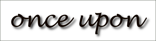
Gimp will save an image with a transparent edge as a .png file.
An example of this is the second image below, where the drop
shadow added to the entire image. Drop shadow creates a
transparent edge in this situation.
You can change a .jpg file to a simpler and smaller .gif file by
bring up the export menu (File > Export) and then clicking on
the line at the bottom of the menu: "Select file type by Extension"
This will bring up a sub-menu, where you can select a different
file type. Web / graphic designers create logos in gif format,
to keep them small-sized so that they'll open up instantly when
viewed online..
Adding drop shadow to
your text
Create some text on a white background (Lucida Handwriting
Italic ... size
100px)
Highlight the text as above.
Select Filters (on top toolbar) > Light & dark shadow
> Drop shadow.
You might have to click on
the drop
shadow box that might appear at
the bottom of your screen on the taskbar, to
get up the drop shadow menu.
I accepted the default settings
on the menu, by pressing
OK.
I then added a grey
border to it, & got the following
result …
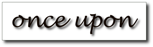
… and then, adding
drop shadow to the canvas itself …
You can select the entire canvas by the keyboard shortcut:
Ctrl + letter A.
Applying the drop shadow to this produced the following
result….
Saved
by File > Save As > Export ….. saved as a PNG
file to
preserve the fade to transparency at the edge of the canvas.
When adding drop shadow to text, I usually keep this to a minimum,
by changing all values (except the opacity) in the drop shadow menu
box to a number 3. You can obviously try out other values, to your
liking.
Changing the image colour to B&W
or to Sepia
Select Colors on the TTB > Desaturate ... this
removes colour...
try out the three possible shades of grey to your liking.
Tone up your image if you like, in Levels.
Add in Sepia
colour, using the following
Colors > Color balance ... add a lot of red ++++, some
green ++,
and then some yellow ++, to your taste > OK.
Easy-peasy.
Sharpening an image (or part of it)
You
might wish to sharpen your image, or part of your image.
Select Filters
on the TTB > Enhance
> Unsharp
Mask.
Have a play with the settings here. However, it's a good idea
to
add only a small amount of sharpness to any image. I think it's a
good idea to reduce Gimp's standard settings to radius: 1.0, &
amount: 0.1, and to keep the threshold at 0. (then press OK).
To reset, use the Undo History Dialog to go back to your original
image, and then try some different settings.
To repeat, just re-open Filters > "Repeat Unsharp Mask". You
could repeat this a few times, and then choose the best result via
"Undo History".
Use Unsharp Mask sparingly, only once or twice, especially
when sharpening portraits ... older folk like myself, don't wish to
appear more lined. :)
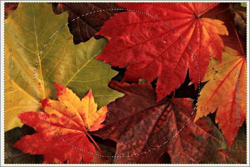
(My thanks to Dennis Apple for showing me "Unsharp Mask"). Using the free select tool, to select part of an image.
To
select an area in the photo to sharpen (or to change in
any other
way), use the free
select tool ~ the lasso icon on the top row of the
toolbox. Have a go at drawing a circle around someone's face with
this ~ please note that the circle must be complete. When you take
your finger off the mouse, you'll see a circle of small dashes moving
around the face ~ "moving ants".
Your selection can have a sharp edge to it, say of 1-2 pixels, or a
soft blurred edge to it, of say 30 pixels. The default setting is 5px.
So click on Select on
the top toolbar > Feather
> 1 - 30 pixels as you wish > OK.
(Click on the Zoom
tool now, to prevent accidental use of the free
select tool).
If you make a bodge with the FS tool, complete your circle, and
then start again with the FS tool immediately to create a new
selection. The FS tool will also act like Photoshop's Pen tool ...
you can create a more sharply defined edge around an object,
by making a series of dot-to-dots ... you must join them all up
at the end to complete the circuit. If you're selecting a difficult
shape, and want to move the underlying image, press down
the Space Bar, which will bring up the MOVE tool. Keep the
space bar pressed down, while you drag the image to a new
position with your mouse. Release the space bar, and then
you can continue with the FS tool selection. This is very handy
when you've enlarged the image previously with the Zoom tool,
making part of the image "disappear" from view.
Now
apply Unsharp Mask to the selected area.
Remove the marching ants ...
Select > None
(or Ctrl +
Shift + A)
Save your work.
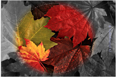
Another thing you could do with your selection, is to alter the
background instead / as well. Select
> Invert.
(Ctrl + letter I).
With the background selected, you could make it black & white,
if you wish .... Colors
> Desaturate.
You could then use Levels,
to enhance the tones also.
To remove the marching ants ...Select
> None
(or Ctrl + Shift + A).
|
|
I used the Ellipse selection tool to create the circular selection here, followed
by Unsharp Mask at Gimp's standard settings,
feathering at 30 pixels to blur
the edge of
my selection. Then I desaturated the background (using luminosity
setting). The images you're looking at are 500 pixels in width. I used Vista's
screen capture tool ~ the Snipping tool, to capture the "marching ants" ... you
will see in the second image, that the (moving) marrching ants are around the
edge of the image and also in the centre of the image, indicating that the
background of the image has been inversely selected. You can also see that
feathering at 30px has created blurring of the edge of the centre selection, with
diffusion of colour into the desaturated area.
Adding a Copyright symbol to
your image ... ©
Press down both the Ctrl & Shift key, while you type the letters
U and A, and then the number 9. Then release all the keys.
Copyright matters
It’s illegal to copy someone else’s photos from any source,
without the owner’s
permission. You
might unknowingly copy
& then use a photo or logo owned by one of the photo-stock
companies. These
images are digitally watermarked, and
you could end up with a nasty letter from
one of their solicitors
demanding payment of several thousand pounds (or face a
court appearance to pay money, plus legal costs). You as
the webmaster would
have to pay up.
You could of course go online to
a company like
IStockPhoto
and pay to use one of its photos. Better still, is to use your own
digital photos & graphics…. graphics such as this one, which
I created with
Inkscape
(which is more free software you
could use).
I've set up a page on this
website, with more info about using
Inkscape.
By the way, if you
publish a photo of an art gallery exhibit,
you’ll need the gallery’s written permission and you might
have to pay a fee
for doing so. The gallery usually owns the
copyright. Be wary also of using anyone’s
text, without
permission and/or acknowledgment.
The National U3A has given its
permission for U3As to use
its logo on websites, stationery, etc. To copy this, do a
Rt mouse click on the
logo, and save it onto your computer.
Creating a banner using WordArt and
Vista's Snipping Tool
The above image is 470
pixels wide by 150 pixels high, and I saved
it as a .jpg image.
Using WordArt in Microsoft Word, I created the text using Arial Black
size 28/32 font. Move
the mouse cursor down the Word document, so
it's not included in the next selection process.
Open Office has its own version of WordArt called Fontwork ... it's
difficult to work out how to use it, but have a look HERE if you wish
to have a go.
Open up Vista's Snipping tool.
To find this, enter "snip" in the search box of the Windows Start menu
(not available with Win XP though). Go to Tools > Options and
untick
the box "show selection ink after snips are captured". Then capture
the text with the Snipping
tool. This works in a similar way to the Print
Screen button, in that an image is saved onto your
computer's
clipboard. You can paste this anywhere you like, but you can now
paste it
onto a blank white background you've created in Gimp.
You can also save the snip, File > Save as, for future use / editing.
Ctrl + N.
Set up the dimensions you'd
like eg 500 x 200 pix,
Resolution 300 px/ins (which is the resolution to use for print).
Ctrl + V to paste the clipboard
image onto the whitebackground.
File > Save As to save your work.
Create a title for your
banner, and choose where to save it, and
the file extension you'd like.
You might have to
experiment with .gif, jpeg, and .png endings to
find out the best quality setting for yourself.
When uploading this image onto your webpage, don't fiddle about
with the image size
when you've done so. or you will end up with
fuzzy text. So if the end result is not quite
the right size, start the
whole process again, using a different font size in WordArt, etc.
Creating Rainbow text on a sky background image
Have a look at these YouTube videos, which I used to create
rainbow text...
https://www.youtube.com/watch?v=nM0XokYaztw
https://www.youtube.com/watch?v=9zqkpnEdCLA
Use the Snipping tool to create the approximate shape you like
.... abt 470 x 150 px, from one of your photos of a blue sky.
In Gimp create a new white canvas of the same size (300px
resolution). Paste the sky snip onto it.
Use the crop tool to remove any surplus white background.
Select the Text tool … font, say, Georgia Bold black colour,
font size 36
Select Layers window / channel.
Rt mouse click on text layer > “Alpha
to selection” (this selects
the text)
Layer > New Layer.
Named as L2. I used the “transparency”
setting offered to me.
Now select the Gradient tool.
Click on Blend tool icon in the tool box below.
Select “full saturation spec” … the first or second one.
Apply the gradient once, twice or three times across the
text
the Crtl key to get a straight line each time. Each time you use
the Blend tool, you will add extra colour to the text.
Increase the contrast if you like …. Colours > Levels
… increase the contrast to your taste
> OK
Remove the marching ants around the text .... Select > None
Save your work. File > Export.
Save your image as .jpg/other onto Desktop /
elsewhere.
With jpeg images choose a Quality of 100 %
Here is the image I created.
And here's a variation on this theme, with a rainbow-effect border.
I used the rectangular selection tool to create an inner border, and
inverted the selection (Select > invert), and then coloured it in with a
70% rainbow colour gradient.
Remove the marching ants (Select > none) and then proceed as
above. Someone who is red-green colour blind, will only see blue
and grey colours unfortunately.
Next up is a blue gradient applied to both the background and to the text.
The font is Trebuchet Bold. Keep the Ctrl button pressed down while you
apply the blend / gradient colour, to get the line of action vertical.
.........................................................................................................
For those of you
who'd like to have a go at making a photo-montage,
have a look at
this brilliant tutorial...
http://tiny.cc/qr8SM
I found
this by a simple Google search, so you could do the same for any
Gimp
topic.
When
I searched Google for more info on "using Layers in Gimp",
I found the following website, which has several topics of interest ....
http://graphicssoft.about.com/od/gimptutorials/GIMP_Tutorials_Learning_The_GIMP.htm
...
just scroll down this webpage, to see more tutorials.
A third website that I've found on a Google search, is Chris Clementi's site,
which is beautifully illustrated...
http://www.kidsnetsoft.com/gimp/tutorial.pdf
He
demonstrates the use of one of the selection tools, called Intelligent
Scissors, feathering to soften the edges of your selection, background
fills
with Gradients and the Paint Bucket, adding text, changing text and
images with
artistic Filter effects, and things you can do with Layers
(positioning and fading
the opacity of a layer).
You can use layering techniques like these to create a background
image for your website, with say a photograph say of a group of
walkers pasted onto a large white background (dimensions eg. 1200
x 3000 px). You'll require a large background like this so that your
walkers image doesn't repeat itself sideways on the webpage or
lower down the webpage when it's up on the internet. If you're
selecting part of a photo, to go on a large white canvas, you might
wish to soften / blur the edges with feathering. Chris Clementi talks
about this in his tutorial.
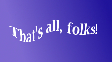
Distorting
text
Below is an image
of some text typed on a new canvas with a blue
gradient on it. While the text tool is still open, you can
distort the text by
selecting Filters (on the TTB) > Distorts >
IWarp. Prior to distorting
the text, expand the size of the surounding text box, to make room
for the new distorted text.
In the pop-up window that appears, you could keep all the options the
same, apart from increasing the distort radius (which
I stepped up
to
108). Then in the preview
window, click & drag the text in several
places to
distort it. Save your image, when ready to do so.
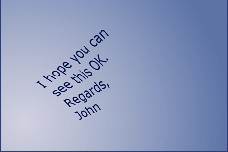
Doing a few more things with
text
If you'd like to
have a go at producing an image like this ...
Start with a blue radial
gradient put onto a new white canvas (700px
width,
300px/inch res.), with the Blend tool.
Dark blue
text added. Expand the size of the surounding text box, to make
room for the new distorted text.
Text
rotated ... Tools > Transform
> Rotate ... click on the blue canvas
just beyond a corner, and drag the corner to a new position, to rotate
the image.
Text
distorted .... Tools > Transform > Perspective ...
.... click
on the corners & drag them.
..... Filters > Distorts
> IWarp ....
....
click on text in the box & drag to warp it.
Layers
flattened to form a single layer (Rt mouse click on Layers
Dialog/palette > Flatten
image)
Colours
enhanced a little in Curves (click on the straight line in
Curves
in two places, and drag the nodes slightly up/down, to
tone up the image)
Image
reduced in size from 700px across to 450px across
Text
sharpened very
slightly in Unsharp Mask
(via Filters > Enhance)
Thin dark
blue border added (Image
> Canvas
size, using dark blue as the
background colour)
Image saved
as a jpeg file (you might have to flatten the layers again).
| Next Gimp page | 
|
|
|