
 |
||||||||||||||
Home
|
Using Gimp
(Part Three)
Using
Layers to blur or highlight parts of an image |
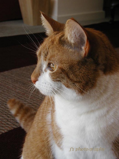
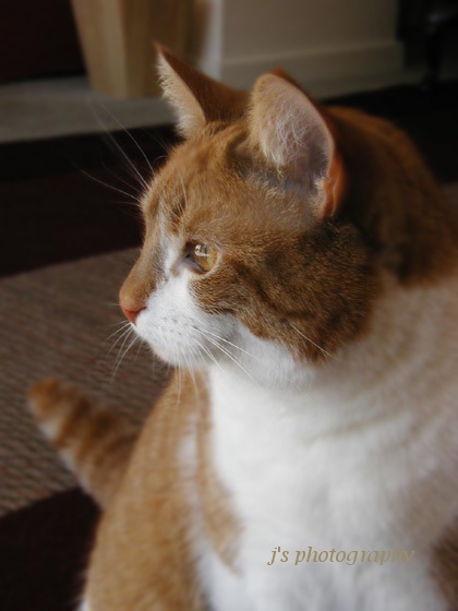
| Before | After |
 |
 |
To add the blur effect, open up your photo into Gimp
(Ctrl + letter O, and then browse for your photo).
If
necessary, scale the
image down in size (to fit your webpage)
(Image
on top toolbar >
Scale image, etc..)
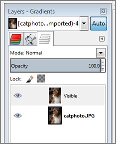 |
You should now see two layers … a visible layer is sitting
on top of the background layer. You can hide the visible
layer if you so wish by clicking on the tiny eye icon
alongside.
Now, to blur the top
layer …
Select Filters
on top
toolbar > Blur
> Gaussian blur
> OK
You can experiment with the
amount
of the blur radius
if you like.
(use Undo History to go back
in time, so you can try out
different amounts of blur)
Select the Eraser tool (the
red India rubber icon) in the
Lt hand panel.
The Eraser tool will erase
the top layer of your image,
to reveal the background layer just below it, so
apply the
eraser to those parts of your portrait you wish to
accentuate, with a
series of brush strokes.
As you’ll see from the second
photo above, I've used the
eraser tool over the cat’s head, and have left the
surrounding
areas as blurred.

To create the following
sloping line
of text …

Create a new white blank
canvas to write on….
Ctrl + N.
Change the dimensions to 200 x 100px.
Standard resolution: 72 px/ins
Select Lucida Handwriting,
size 28, royal blue colour.
Write whatever text you like
on it e.g. “giftaid it”.
To centre the text on the canvas, click on the Move
tool, then click on one letter in the text, & then drag
the entire line of text to a centre position.
This text
is on a separate
layer, and can be rotated ….
Click on Tools (on the top
toolbar) > Transform
> Rotate.
Rotate it as you wish, and
then click on the Rotate
button on the menu.
large white space in the layers panel >
Before you save your work, you
could crop the image
slightly, to reduce the amount
of white space around
the text.
to a
folder of
To create a lens flare effect on your text
...
 |
After creating the text on a
graduated blue background using
Lucida Bright
Italic Semi-bold font, plus a little drop shadow,
I flattened the
two layers (text and background layers) by a Rt
mouse click inside
the white area in the Layers Dialog box.
Then I selected
Filters > Light and Shadow > Lens Flare
I re-positioned
the flare by adjusting the x and y values, and then
saved my work.
Filling text with an
image
http://boitblog.blogspot.com/2008/12/filled-text-tutorial.html
Create a new image (Ctrl + N & then alter size to 600 x 180px)
Create a text layer (eg Impact Condensed
font, size 77)
Select using the "Select by Colour tool ... you'll now see the
"marching ants" around the text.
Now delete the text layer use your Delete key, to leave
selection!
Copy your flower photo (cropped to same size ..
... Ctrl + A and then Ctrl + C
Go back to your text image & select Edit > “Paste Into”
Add a drop shadow to a selection
(via Filters > Light & Shadow)
Anchor the layer (Layer
> Anchor Layer)
Flatten the image
.............. Rt mouse click on white space in Layers dialog
Remove the "marching ants" ... Shift + Ctrl + A
& then save the image ... File > Export
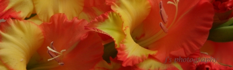
Here
is one of my flower photos, which I've cropped ...
 |
 |
 |
If you’d like to create
interesting designs with text, to
go onto
your website, have a look at
Wordle dot net.
examples
of designs created out of text. The FAQ section
gives you
some
ideas on how to use the site, and how to save
your work.
with a ~ , so that the order of the
words doesn’t
randomise.
 |
Touching up old photos
Often such photos will be showing signs of old age …
scratches / scuff marks,
old age spots on the white borders
or frayed edges or water stains.
To start with you will need to digitise them … I use my
camera mounted on a
tripod (for extra sharpness). Some
people use scanners, but these would have to
be of high
quality to get a good image. Taking shots with a camera
can
sometimes lead to slight distortion of the image, with
slight bulging of the
image at the sides. All you need to do
here, is to crop the image & at the
same time, trim off any
defaced white borders (with view to adding some brand
new borders yourself later). If your image has a fair amount
of white in it,
you will need to increase the exposure
compensation on your camera to preserve
the whiteness
(otherwise your whites will look grey).
If your image is discoloured due to past water damage,
you
can change this colour to B&W using Gimp …
Colors > Desaturate …
experiment with the shades of
grey on offer, & choose the best grey colour.
Later on,
you can enhance the image using Curves … change the
straight line to
a slight S curve (to enhance both the dark
and the light tones in the image),
to make the image look
more vivid. This will help enhance faded colours in old
colour photos too.
It might look good to re-colourise a desaturated B&W
photo with sepia colour (Colors >
Color balance … add
red +++, green ++ and some yellow ++, to your liking).
Beforehand you will need to spend some time using the
Clone
tool (use a soft brush with medium opacity) to repair
all the defects in the image.
Then you might have to use
Unsharp Mask, to sharpen the image slightly. The
whole
process can be very time-consuming.
Here are two photos of my late father (taken in Army uniform
in abt 1940) ... a copy of the original alongside one that I've
touched up. You will see that I haven't quite got rid of the
water stain just below his tie, and there are also numerous
tiny defects which would take a lot more work to remove.
Click on each photo to see a larger image.
Before 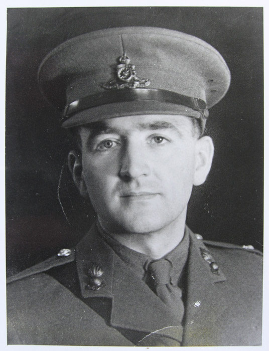 | After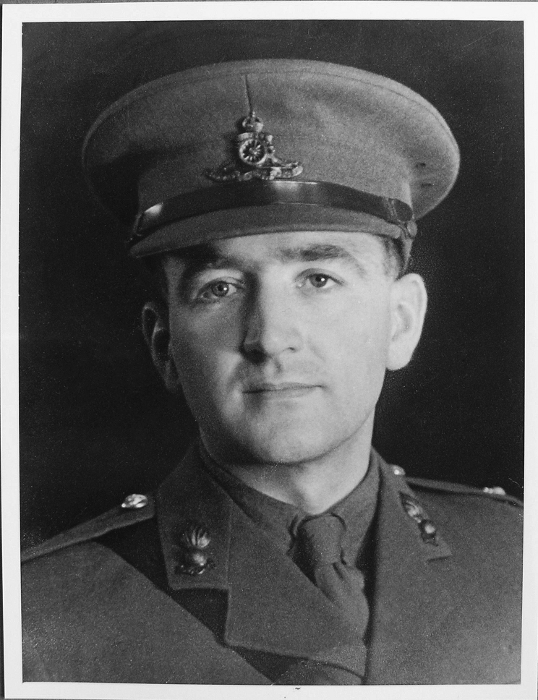 |
Putting names onto old family photos.
First of all, create a new layer on top of your image (Layer >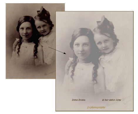 |
I've inserted / pasted the HTML code
I've created for this, into the
source code of
this webpage, & then uploaded this Gimp page &
the image to see
if it worked ...

|
Yes, it did ... I left the exclamation marks as they are, above the
image, as they don't show up when online.
(I've had a go at adding a javascript mouse-rollover effect
(colour change), but this didn't work for me).
(click on above image to see a larger version)
| ................ Page about handling RAW images |  |